Fed Discontinues “Excess Reserves” Chart
August 15, 2013 Leave a comment
The St. Louis Federal Reserve Bank will no longer publish the chart showing excess reserves of commercial banks.
I can say little about why this decision was made. I suspect the Fed wants to draw minimal attention to the fact that most QE money goes into excess reserves.
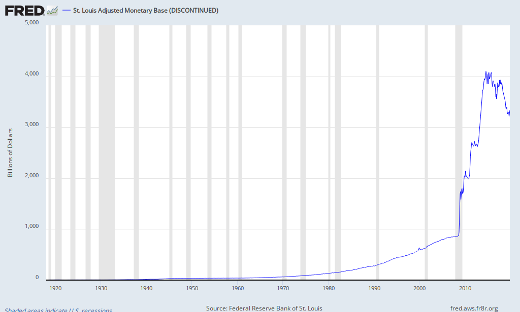
The charts unequivocally show that the increase in excess reserves has corresponded almost exactly to the increase in the Fed’s monetary base. Observe:
MONETARY BASE
EXCESS RESERVES

–
Why is this important? It shows to what extent the Fed’s different batches of QE are stockpiled by the commercial banks rather than pumped into the economy in the forms of loans.
When the Fed increases its balance sheet, the general rule is that the money will cause the money supply to increase because of fractional reserve banking.
However, after in the 2008 crisis, the M1 Multiplier tanked, meaning that each dollar added to the monetary base added much less to the money supply (M1).

–
The Fed has expanded its monetary base dramatically, but the M1 Multiplier makes us wonder where all that money went. The excess reserves chart shows us where most of the QE money goes.
As QE continues, we will have to assume excess reserves are rising if the M1 Multiplier remains extremely low. If the multiplier begins to rise, then more new money is entering the economy, not being added excess reserves. If M1 begins to skyrocket, then that means excess reserves are being loaned out.
— No more excess reserves charts —
