David Rosenberg on Canada vs. the US
June 6, 2013 Leave a comment
Debate rages on about how sustainable or even real the economic recovery is in the US.
David Rosenberg, former chief economist at Merrill Lynch, showed a presentation at one of John Mauldin’s recent conferences. It is entitled: “The Fed Is Trying Like Crazy, But Nothing It Does Can Save The Economy.”
The presentation consists of 60 slides that collectively devastate the case for expecting serious economic recovery in the US. The charts are extremely convincing. The argument he builds with his evidence seems irrefutable.
You can see the entire presentation here. It is worth your time.
While Rosenberg is very bearish on the US, he seems optimistic about Canada. He thinks the “short Canada” trade is a huge mistake.
He draws his conclusion about Canada mostly by looking at 2013 Q1 data, but overall he underestimates Canada’s problems. Canada’s housing sector is more distorted by intervention than he realizes, and our employment data is terrible.
He also downplays the interventions of the Bank of Canada. He says Canada has performed better than the US “without nearly as much … expansion of the central bank balance sheet.”
Is this actually true? The BoC deflated in the immediate aftermath of the financial crisis, but it has been busy making acquisitions in the last couple years. In two years, the BoC has expanded its balance sheet by about 30%, whereas the Fed has expanded by about 20% in the same time.
The Fed:
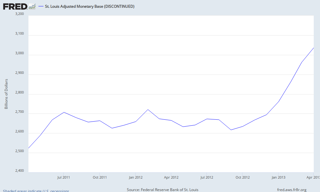
–
Here is the BoC monetary base (this chart uses data from here):
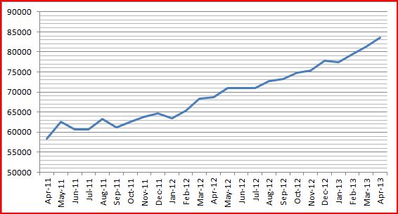
–
I think Rosenberg is right on the US and a bit off-base for Canada.


